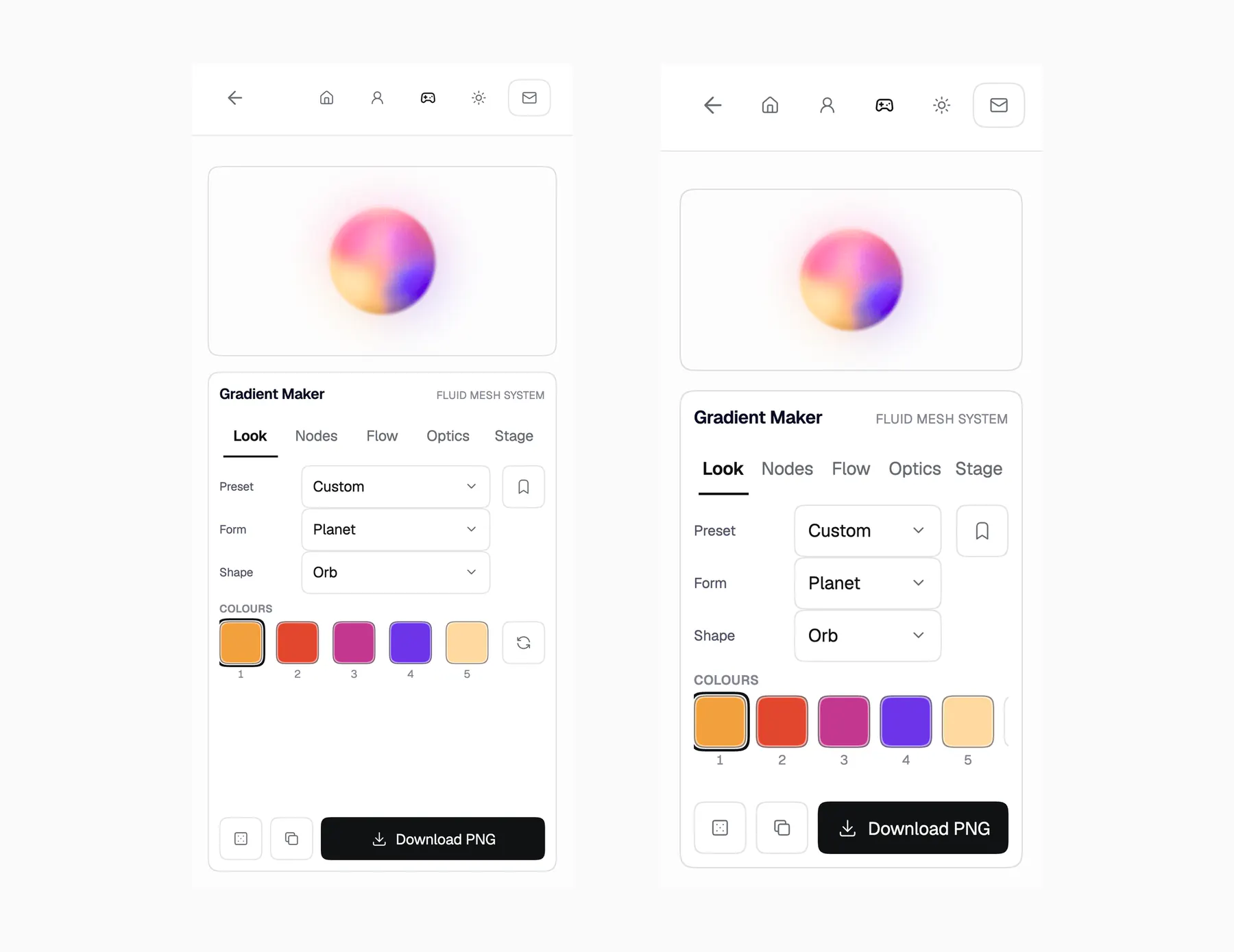
Gradient MakerNineteen versions to make a gradient that stops looking like one.
- Role
- Designer & builder
- Team
- Solo
- Built with
- WebGL, no libraries
- Controls
- Thirty, in five groups
- Year
- 2026
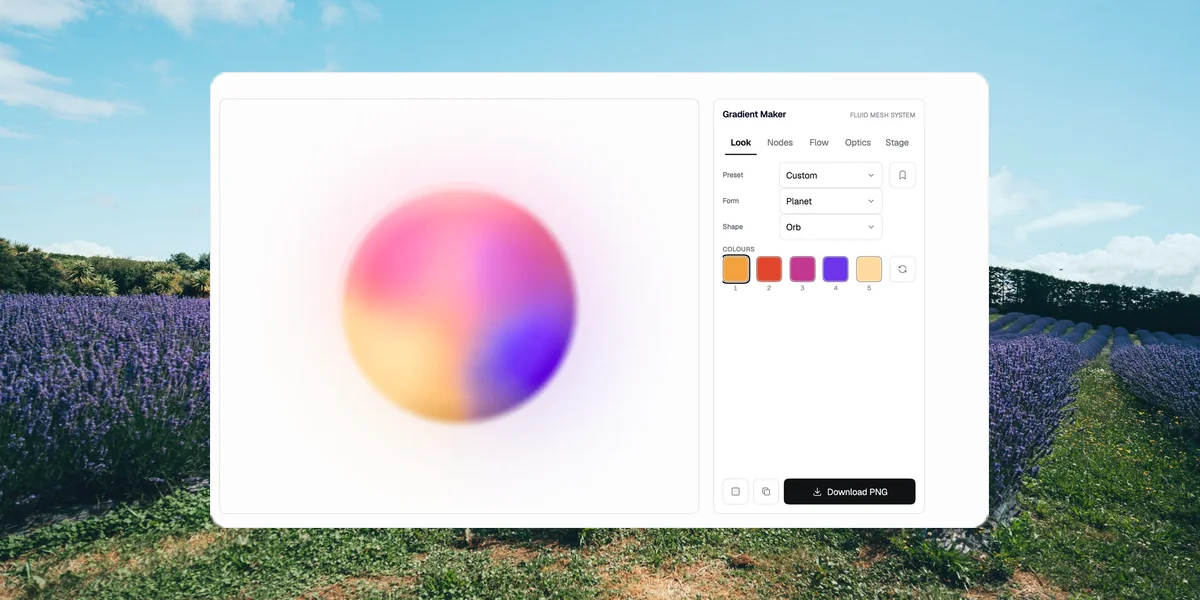
Gradient Maker is a builder for the soft, volumetric colour fields I kept saving to a reference board and could not reproduce anywhere. Five colour sources blend perceptually and drift on their own clocks; you dial one in and leave with a PNG or a snippet.
Every tool made gradients. I wanted the ones on my board.
I had two reference boards full of images I loved and no way to make one of them. Every generator gave me the same soft plasma: pretty, generic, nothing like a mass of colour with a taut flank and a long feathered tail. So I wrote down what was happening in those references, in plain language, and built controls for that instead of for shader parameters.
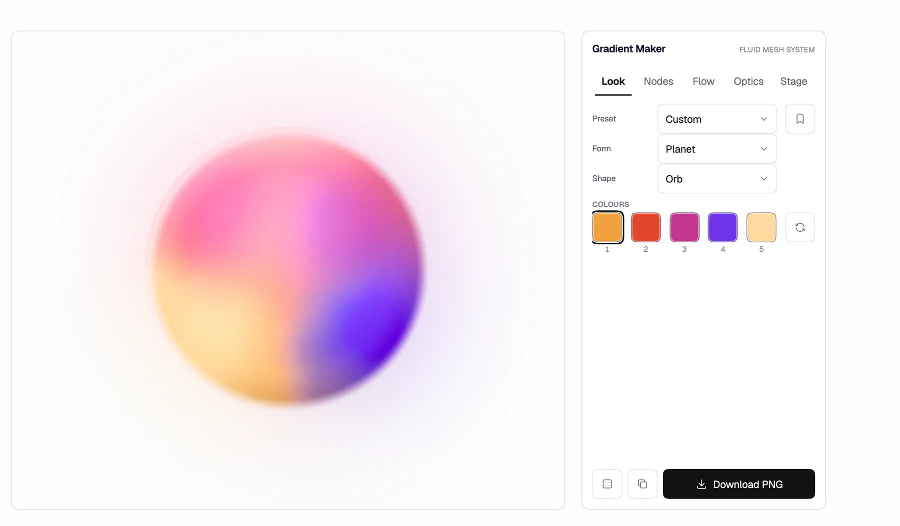
The controls are named for physics, not for effects.
Speed, Melt, Wobble, Sweep, Contour, Tension, Rim, Layer. Tension exists because a real mass has a tight flank facing the light and a long dissolve behind it, and that asymmetry is what makes a crescent read as swept rather than blobbed. Layer exists because averaging colours evenly makes smudge, while compositing them in an order makes the references.
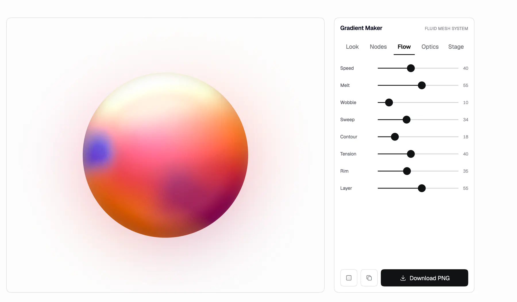
Six of the presets are the reference images themselves.
Each one exists to prove the engine can hit that exact picture, and the holes they exposed became controls. Randomize does not sample evenly either: it draws from a few archetypes with light in the upper third and locked relationships between the five colours, which is why a random pull still comes out pretty.

Version twelve was better in every part and worse as a whole.
It brought zone hierarchy, brush-stroke taper, coherent rotation and warm glass seams, and it lost the colour cohesion that made the thing worth looking at. I reverted all of it. The rule since is one change at a time, with Ember as the baseline anything new has to survive, and new looks arriving as forms you can choose rather than as changes to the one that worked.
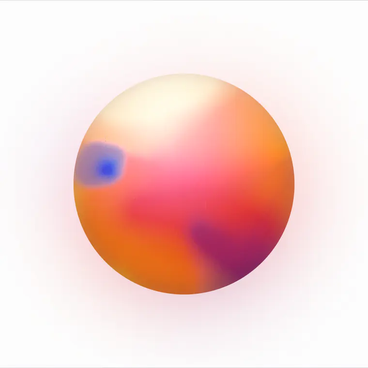
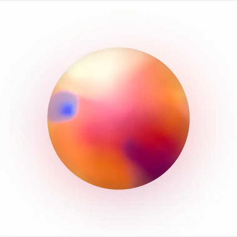
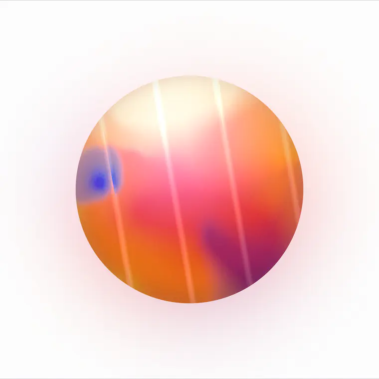
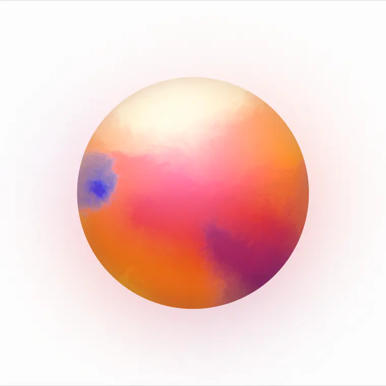
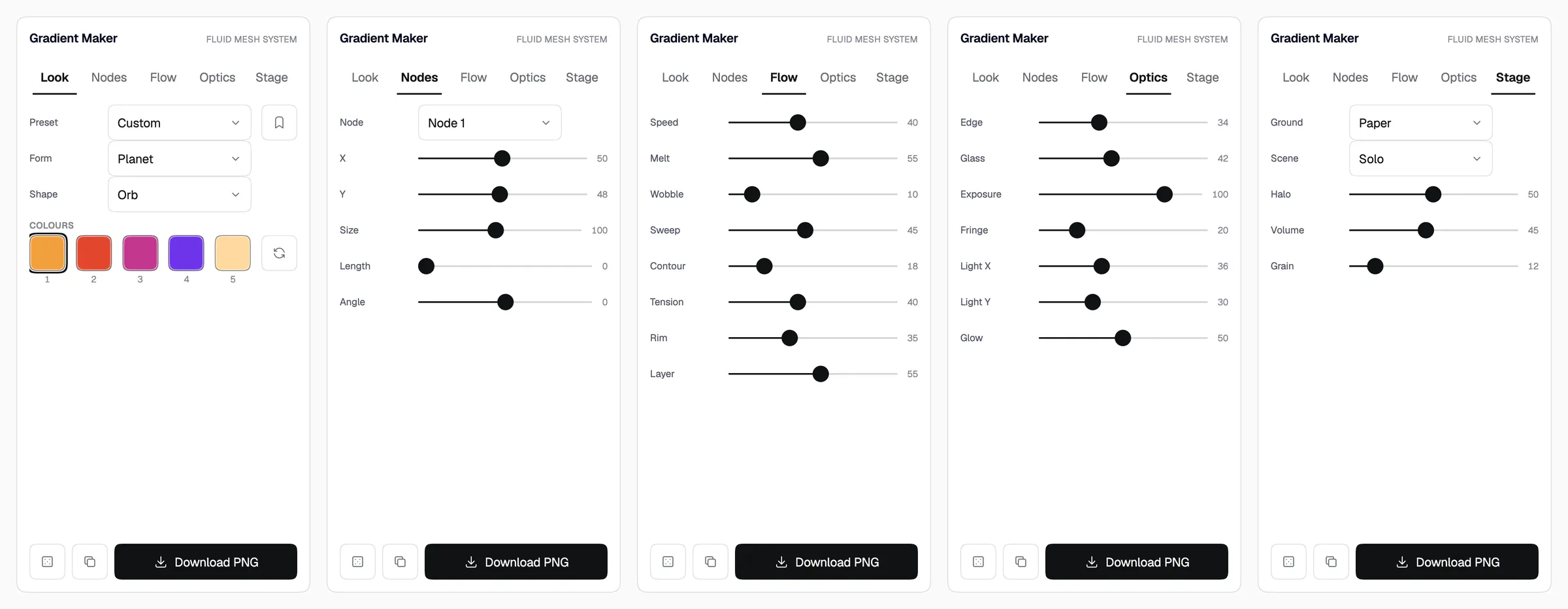
Thirty controls, and the panel never scrolls.
The answer was fewer at once, not a taller box. Thirty in one column made a scroller whose last rows nobody could reach. They are five groups now, one open at a time, each named for what it affects, so the group label does the explaining and the page carries no instructional prose at all.
I was judging the orb on paper it would never sit on.
Everything got designed on the near-white background of the tool and then used somewhere else. Stage puts it on the grounds it will actually land on. Ink is in that list and Ink does not work: the halo crushes to black and the feathered limb reads hard. I left it in and wrote the failure down, because deleting the case that exposes a limit is how you forget the limit.
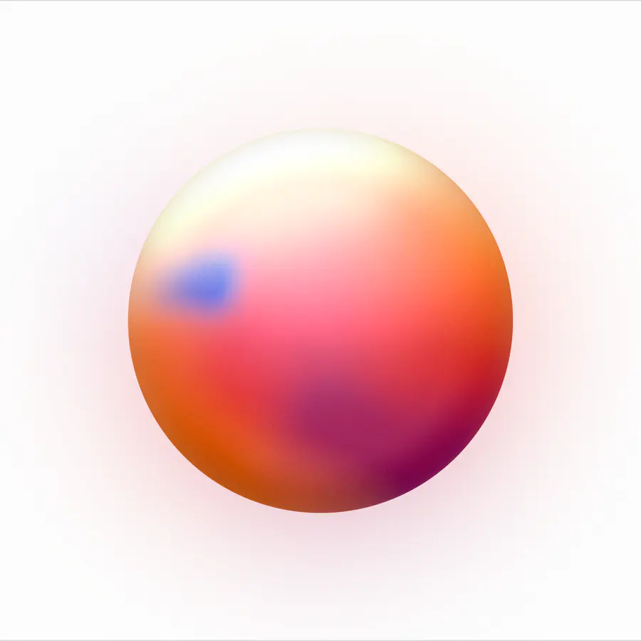
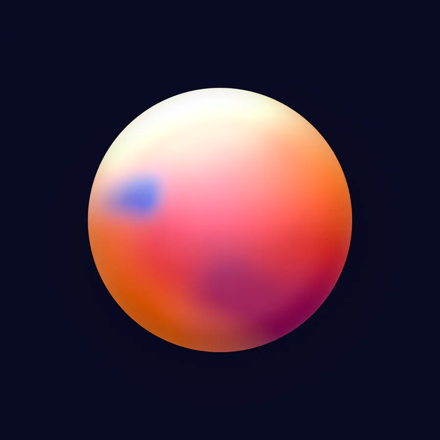
It is where the rest of the site gets its colour.
The engine came out of the tool and went into the portfolio. The phone mockups in these case studies stand on grounds it generates, and the time of day skies come from the same table. A tool that only made pictures for other people would have been a smaller thing than one I have to keep honest by using.